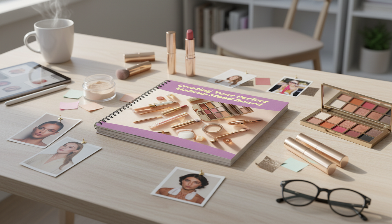
A makeup mood board turns scattered inspiration into a clear visual plan for cohesive looks—perfect for everyday routines, events, photo shoots, or a seasonal refresh. Instead of saving hundreds of random screenshots, a well-edited board helps you decide on a color story, finishes, and technique details you can actually recreate with the products you own (or plan to buy).
Think of a makeup mood board as one visual hub that captures the overall vibe: textures, finishes, lighting, and a consistent color story. When you can “see” the look as a system, it becomes easier to build repeatable combinations rather than one-off experiments.
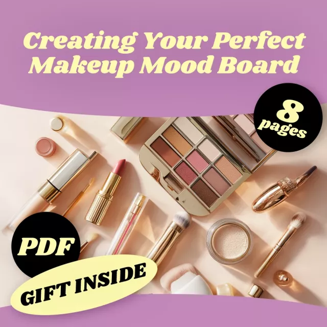
If you want a ready-to-follow framework for layouts, palettes, and look formulas, consider Creating Your Perfect Makeup Mood Board | Digital Guide for Designing an Inspiring Mood Board for Makeup Looks, Styles & Color Palettes.
The fastest way to end up with a chaotic board is to gather images before you define the concept. Choose a single anchor so every tile has a job.
Tip: If your wardrobe influences your makeup choices, a seasonal closet plan can help you keep your overall style consistent. Pair your board with Plan Your Perfect Year-Round Wardrobe | Seasonal Wardrobe Checklist & Closet Planning Guide | Digital Download to align makeup vibes with what you actually wear.
Collecting references is fun—editing them is where the magic happens. Start broad, then refine hard.
When you’re choosing colors, tools like Adobe Color can help you sample tones from a single image and build a balanced palette.
A gorgeous palette isn’t helpful if it doesn’t map to real placements (eyes, cheeks, lips) and real product categories (liner, blush, lipstick). Start with one image that’s unmistakably the vibe, then pull 5–7 colors from it.
| Palette role | Where it shows up | Easy product types | Effect |
|---|---|---|---|
| Base neutral | Crease/contour/outer corner | Matte shadow, contour powder | Structure and depth |
| Soft midtone | Blush/transition | Blush, satin shadow | Harmony across the face |
| Highlight tone | Cheekbones/inner corner | Highlighter, shimmer shadow | Lift and brightness |
| Accent color | Liner/lid/lip | Gel liner, liquid shadow, lipstick | Statement and mood |
| Deep anchor | Tightline/outer lashline | Pencil liner, deep matte shadow | Definition and contrast |
For consistent color naming (especially if you collaborate with a bridal party or content team), referencing standardized systems like Pantone Color Systems can make shade discussions more precise.
The best boards are easy to read while you’re actually doing your makeup. Keep the layout simple and scannable.
If you’re building your board in a design app, Canva Design School has practical tutorials on spacing, grids, and visual hierarchy that translate perfectly to mood board layout.
A mood board becomes truly valuable when it produces repeatable “formulas.” Create tiers so you always have an option that fits your time and energy.
To keep motivation high while you practice, a simple mindset routine can help you stay consistent—some people like pairing creative projects with daily prompts like Think Happy: Affirmations Pack – Affirmations for Positive Thinking Bundle | 5-in-1 Digital Download for Mindset, Calm & Daily Motivation.
Include core mood references, a small color palette, texture/finish cues, 2–3 full-face examples, and short technique notes like liner shape, blush placement, and lip finish.
Most boards work best with 3–5 core shades plus 1–2 accent colors, including at least one light and one deep tone for balance across different looks and lighting.
Choose one concept, repeat one key shade or finish across multiple tiles, keep your palette limited, and edit down to a small set of the strongest images.
If you have any questions, here are some useful links:


Leave a comment