Olive skin can read warm, cool, or neutral depending on lighting, fabric color, and contrast—making “what looks best” feel inconsistent from day to day. A more reliable approach is to build around a few high-impact hues, supportive neutrals, and repeatable outfit formulas that flatter the green-gold undertone without washing it out. Below are color families that tend to amplify olive skin’s natural depth, plus practical ways to turn them into easy outfits and a cohesive capsule wardrobe. For more guidance, see [PDF] Local Learning – Journal of Folklore and Education.
Olive undertones often include a subtle green/gray cast that shifts based on the colors surrounding your face. When a shade boosts contrast (think saturated, clearer colors), skin tends to look brighter and more even. When a shade lowers contrast (especially dusty or muted tones that are close to your skin’s depth), it can emphasize sallowness or under-eye shadow. For further reading, see A Dictionary of Literary Symbols.
Lighting and fabric finish add another layer. Warm indoor bulbs can pull yellow in some colors, while daylight can make cool colors look sharper. And reflective fabrics (satin, silk blends) bounce light back onto the face differently than matte knits—sometimes making a “meh” color look surprisingly good in motion. If you’re curious why your bathroom mirror and your phone camera disagree, it helps to know that color rendering varies by light source; the CIE Color Rendering Index (CRI) explains how accurately a light reveals colors.
Rather than hunting for one “perfect” palette, focus on a few dependable families: jewel tones, rich earth tones, and crisp neutrals. They’re flexible across seasons and easier to repeat in outfits.
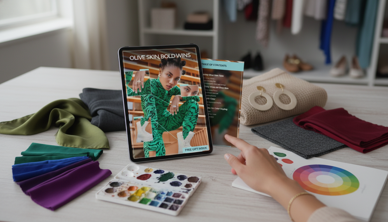
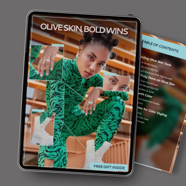
Emerald, teal, cobalt, sapphire, and ruby often create a clean, luminous effect against olive undertones. These shades tend to be saturated enough to counterbalance any green-gray cast, especially near the face (tops, scarves, collars).
Terracotta, rust, warm olive, chocolate, and camel echo natural warmth without turning skin flat. The key is choosing earth tones that feel “rich” rather than pale or yellow-beige.
Bright white, ink navy, espresso, and charcoal add structure and make bold accents look intentional. Many olive complexions look sharper in these neutrals than in mid heather gray or washed-out beige.
Gold and bronze frequently harmonize with olive undertones. Some olive complexions also look great in brushed silver—especially if you like higher contrast outfits or your go-to neutrals lean charcoal and navy. For consistent color naming when you shop online, it can help to recognize standardized systems like Pantone color systems, which brands often reference when developing seasonal palettes.
| Color family | Usually a strong pick | Use with care | Easy pairing idea |
|---|---|---|---|
| Jewel tones | Emerald, teal, cobalt, deep magenta | Very dusty pastels that reduce contrast | Cobalt top + dark denim + gold jewelry |
| Earth tones | Rust, terracotta, warm olive, chocolate | Yellow-beige that can look sallow | Terracotta dress + tan sandals + cream bag |
| Neutrals | Bright white, ink navy, espresso, charcoal | Mid heather gray close to skin depth | White tee + espresso trousers + red lip |
| Pinks & reds | Tomato red, cherry, berry | Very cool baby pinks that can look chalky | Berry knit + charcoal skirt + black boots |
| Blues & greens | Deep teal, pine, navy | Muted sage that can read gray on some olives | Pine blazer + white tank + dark jeans |
Hold two versions of a color near your face: one mid-tone and one deep. Many olive complexions look strongest in medium-deep, saturated shades—deep enough to add definition, but not so dark that the color overwhelms your features.
Try bright white by your face. If it looks crisp and brightening, higher-contrast outfits usually flatter (white + navy, white + espresso, jewel tones with dark denim). If bright white feels harsh, switch to cream or soft white and keep the contrast with a saturated accent (cream tee + teal scarf, cream blouse + rust earrings).
Test one warm shade (rust) and one cool shade (cobalt) under similar lighting. Many olives can wear both—when the color is clear and saturated rather than dusty. If a shade makes under-eye shadows more noticeable, swap to a richer cousin (sage → deep teal; beige → camel; pale pink → berry).
Choose a jewel-tone or rich earth-tone near your face, then anchor it with a dark neutral and a metallic detail. Example: emerald blouse + charcoal trousers + gold hoops.
Saturated jewel tones like emerald, teal, and cobalt—and rich earth tones like rust and terracotta—are common “instant brightening” picks for olive undertones. The most flattering option depends on your personal contrast level and whether bright white or cream looks fresher near your face.
If you have any questions, here are some useful links:


Leave a comment