Color coordination gets easier when a few clear rules meet the speed of AI. With the right apps and workflows, outfit planning can move from trial-and-error to consistent, repeatable combinations that fit your season, lifestyle, and closet. The best part: you don’t need an enormous wardrobe—just a reliable set of neutrals, a controlled accent palette, and a simple system you can reuse all year.
Color matching isn’t about perfect “rules”—it’s about removing friction from getting dressed and making outfits look intentional.
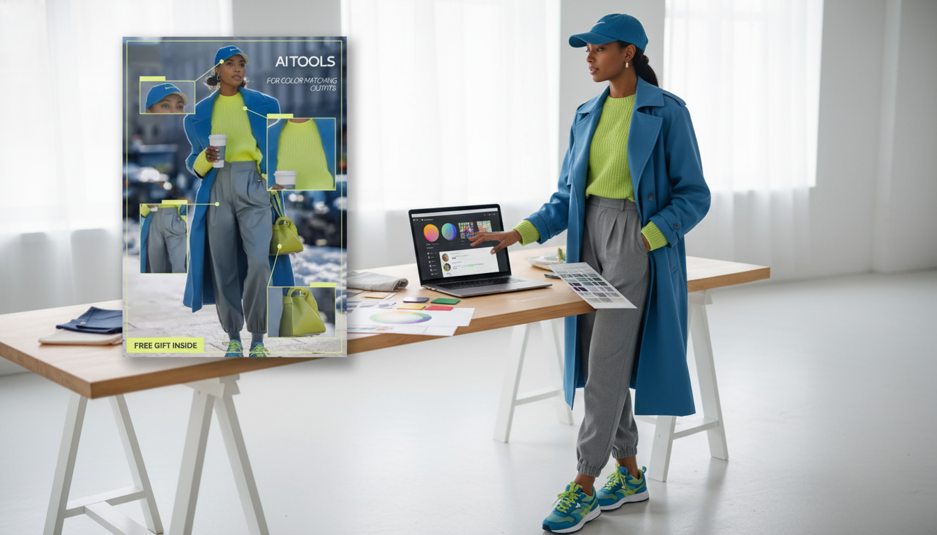
Most outfit color-matching tools are doing some version of “read the colors, then apply harmony logic.” Knowing the basics helps you spot good recommendations instantly and ignore the off ones.
| Goal | Base | Secondary | Accent |
|---|---|---|---|
| Effortless everyday | Neutral (black/navy/ivory/denim) | One muted color | Metal/leather detail |
| Office-polished | Dark neutral | Light neutral | One color accent (scarf, shoe, bag) |
| Weekend statement | Neutral | Neutral | One saturated piece (top or jacket) |
| Minimal and modern | Two adjacent hues (e.g., blue + teal) | Same value range | Texture contrast instead of color |
Not every “outfit app” is truly good at color. The most useful tools do four things well: read color accurately, keep recommendations wearable, learn your preferences, and make repeat outfits easy.
For color harmony references that mirror what many tools use behind the scenes, Adobe’s color wheel and harmony rules are a helpful baseline: Adobe Color. If you want deeper context on color direction and seasonal trend logic, Pantone Color Institute is a respected reference.
A repeatable workflow matters more than the specific app. This setup gets results quickly and keeps your closet “mixable.”
If you like structured, step-by-step setup with templates you can reuse, AI Tools for Color Matching Outfits – Smart Fashion eBook Guide can help you build the system faster and keep it consistent.
For anyone styling for camera (Zoom, content, interviews), contrast matters. A simple, science-backed reference point is the WCAG guidance on contrast, originally designed for accessibility but useful for visual clarity: W3C Web Content Accessibility Guidelines (Contrast).
To make this easier season to season, pair your palette with a checklist you can run quarterly: Plan Your Perfect Year-Round Wardrobe (Seasonal Wardrobe Checklist & Closet Planning Guide).
For a focused, practical setup you can revisit whenever your closet changes, consider the AI Tools for Color Matching Outfits – Smart Fashion eBook Guide alongside the Seasonal Wardrobe Checklist & Closet Planning Guide.
Yes, especially when you tag items (or yourself) as warm/cool and keep a few “trusted neutrals” as anchors. Many tools infer undertone from photos and your saves/likes, but results improve when you validate colors in natural light and consistently choose the same core neutrals (like ivory vs bright white, camel vs cool gray).
Most cohesive outfits land at 2–4 colors: a base (largest area), a secondary, and a small accent. Monochrome can work with one color if you add contrast through value shifts (light-to-dark) or texture (knit, denim, leather).
Photograph key items, use an app to extract dominant colors, then pick 2–3 neutrals plus 4–6 accents that share a similar saturation level. Save a few templates (like dark neutral + light neutral + accent) and store 10–15 outfits so you can repeat what works without rethinking it daily.
If you have any questions, here are some useful links:


Leave a comment